DRYICE
Project
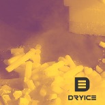
DryIce and its purpose as a brand and company are much bigger than they actually appear.
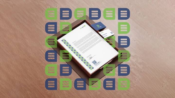
We sought to build an identity that represented solidity, fusion and change – as happens in the process of chemical reactions in dry ice – without leaving aside the idea of trust, credibility and modernity, as well as the very idea of uniting elements and values aimed at DryIce’s environmental issues in the dry ice production and distribution process.
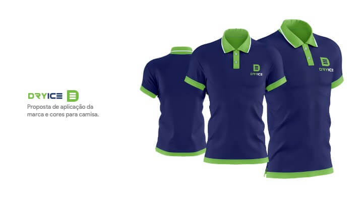
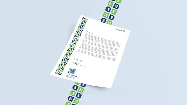
We seek to make the brand more “young” and applicable in digital media. Therefore, we also revived the energetic colors based on the already existing color palette at DryIce to bring a modern identity.
Branding

In your main signature, the logo comes in two formats – vertical and horizontal – which must be used as presented here.
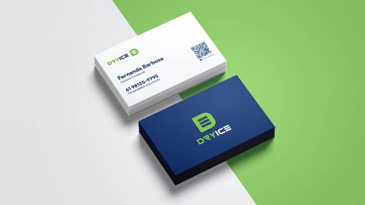
Green and blue are the main colors.
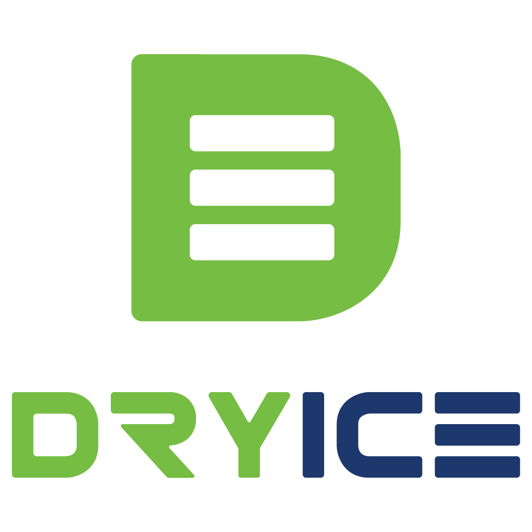
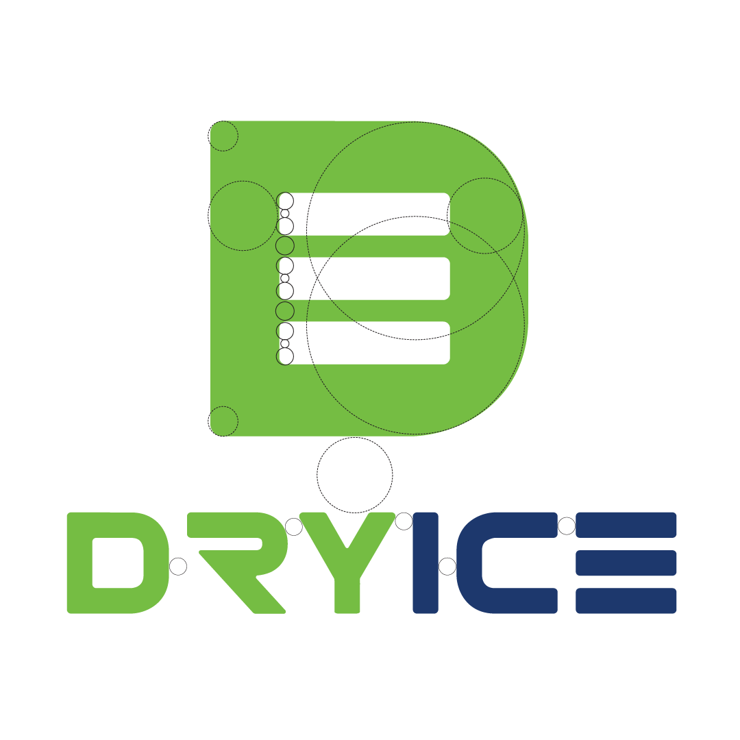
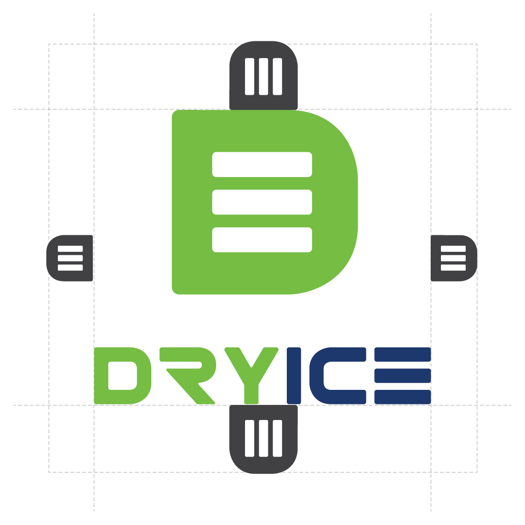
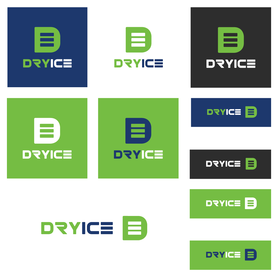
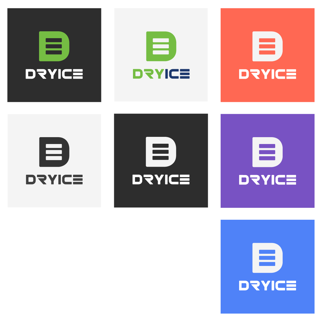
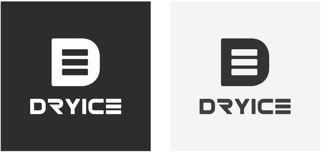
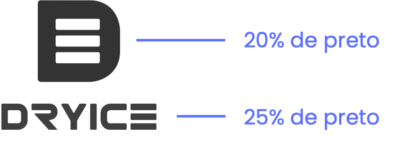
In its secondary versions, the logo has 4 variations with specific color combinations, valid for the vertical and horizontal versions and which must be respected as presented in this manual. In addition to the b&w versions that will be presented below.



DRYICE
Social Media




Did you like this project?
See how easy and uncomplicated it is
start your project with Buzz61.
Start Here
Click the button below to schedule your appointment.
Online Consultancy
We will understand your project and define deadlines and values.
Plan and Execution
After planning, we will create everything you need.


